FindMe
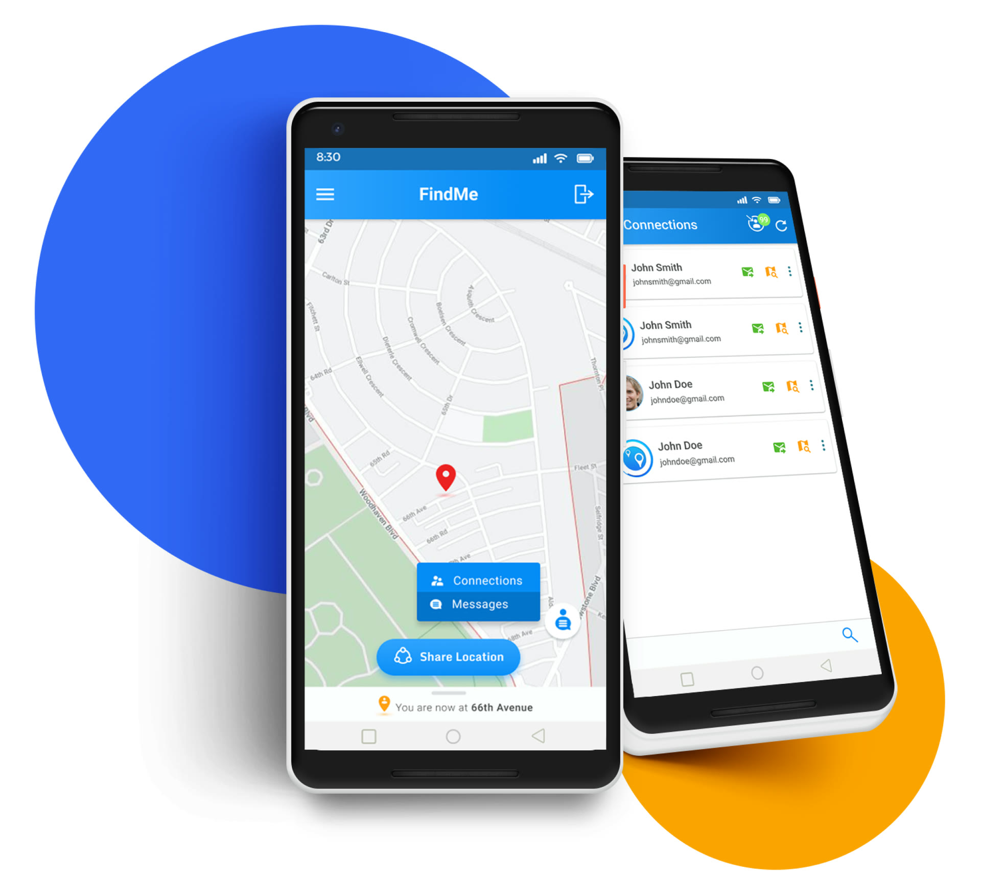
UX/UI redesign of a location sharing app for checking on friends and family.
- Active users
- +50%
- Final screens
- 9
01 / Role
Solo designer, client in the loop
Owned
- Competitor Analysis
- Wireframing
- Design System
- Prototype
With The client via Agile, and the developer who got the prototype
02 / Process
Five key steps, benchmark to prototype
-
01
Competitor Analysis
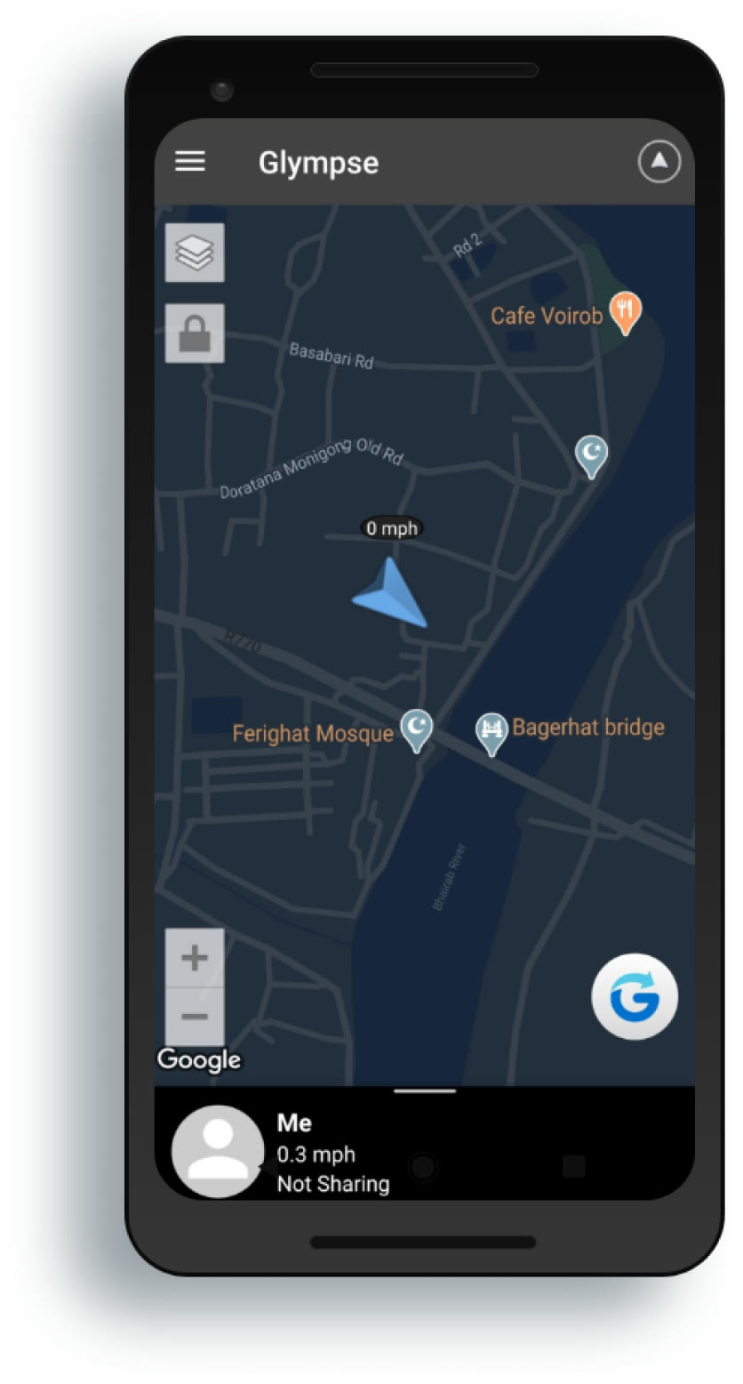
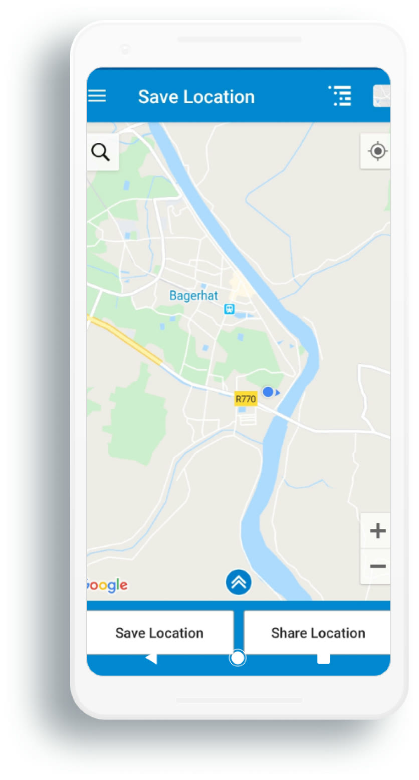
Compared Glympse and Save Location on performance, user engagement and design gaps.
-
02
Brainstorming
Backlogged feature ideas and user problems: what to add, improve or eliminate.
-
03
Wireframing
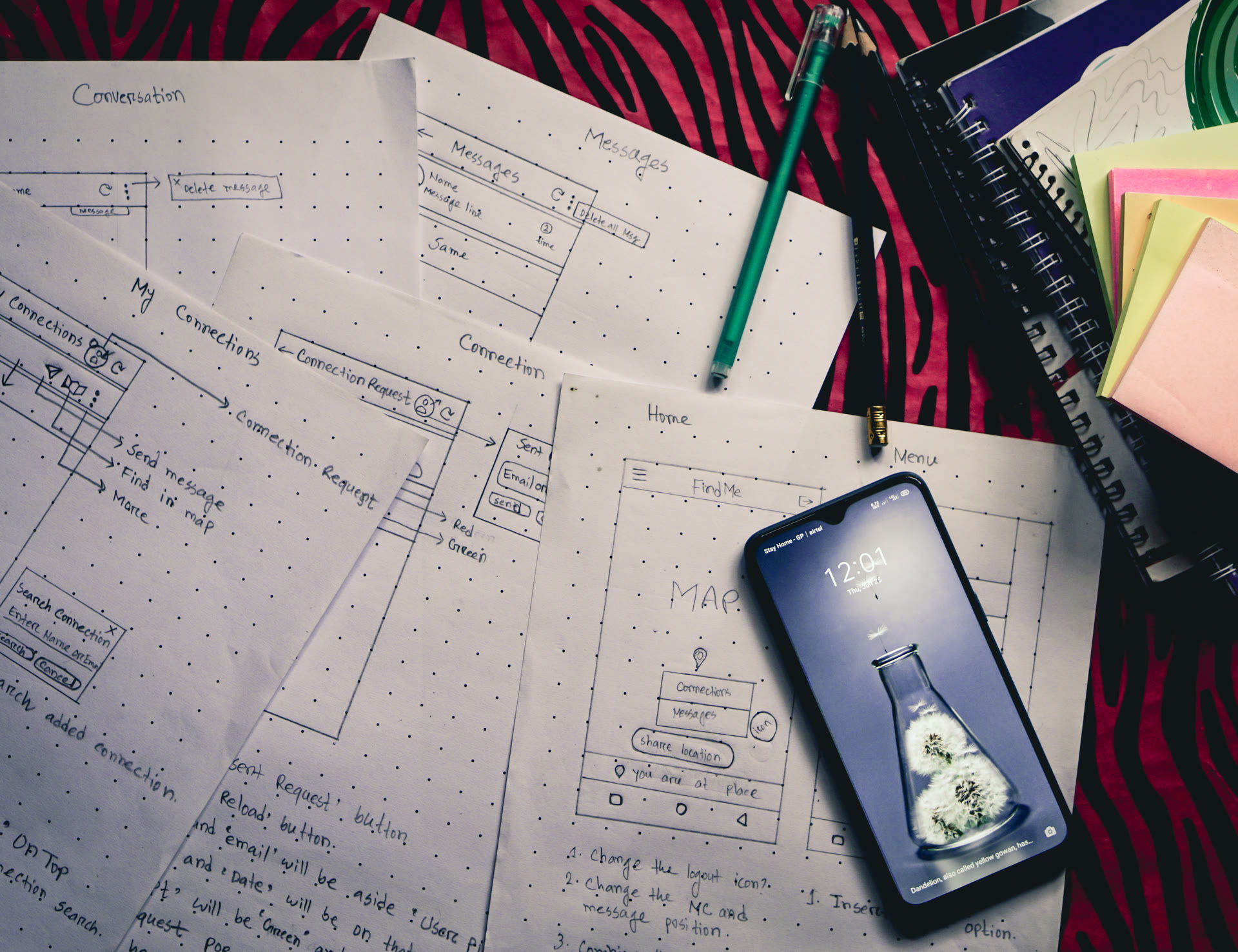
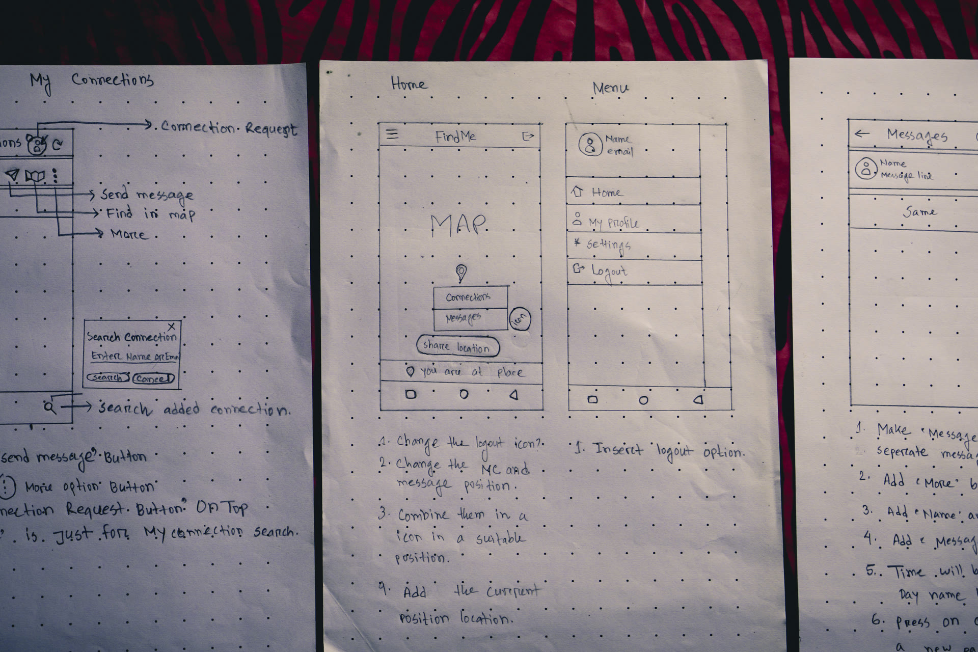
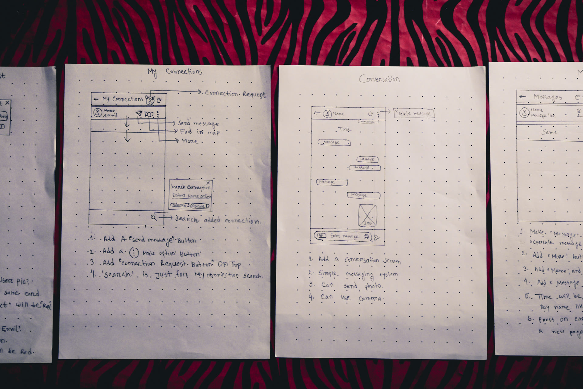
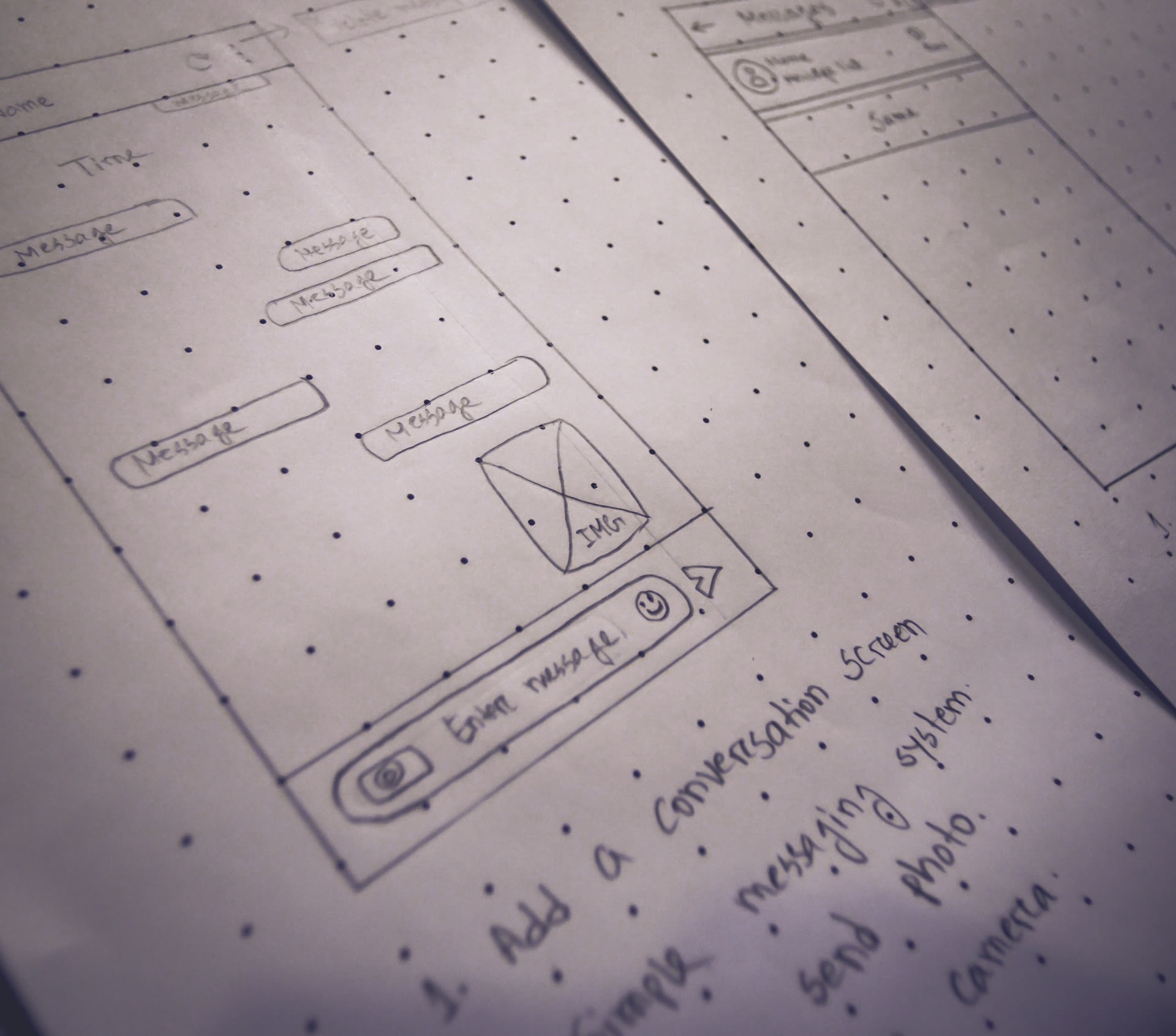
Pencil and paper sketches of the ideated features and the user flow.
-
04
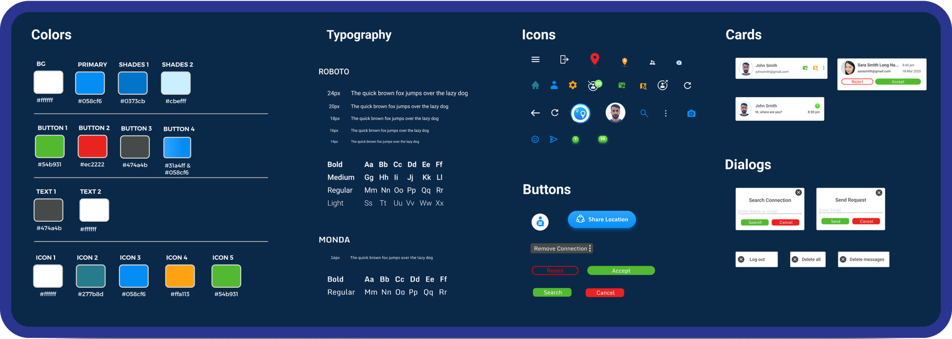
Design System
Colors, typeface, icons, buttons, cards and dialogs, reused across every screen.
-
05
Prototype
A prototype for the developer, showing how navigation works.
One style guide behind every screen
- Colors
- Typeface
- Icons
- Buttons
- Cards
- Dialogs
03 / Redesign
Four screens, before and after
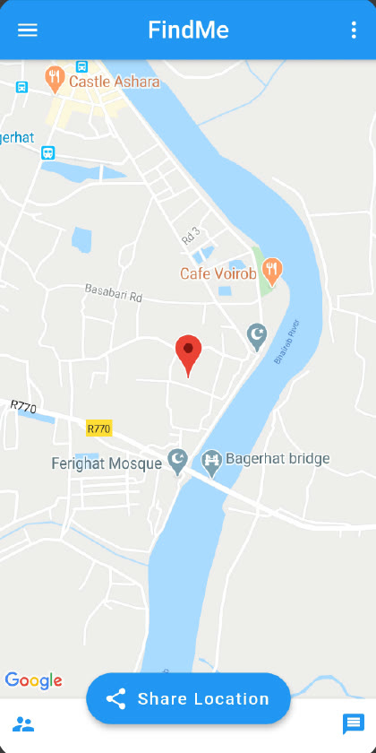
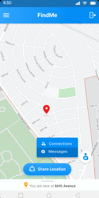
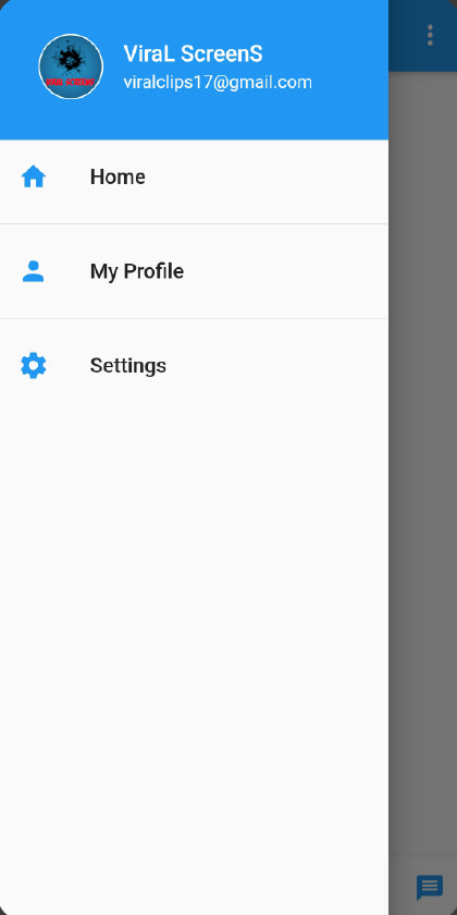
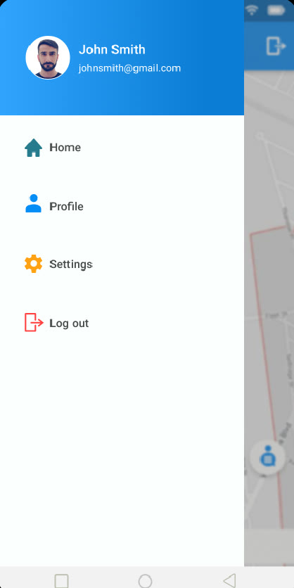
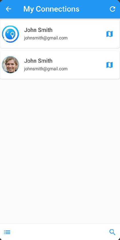
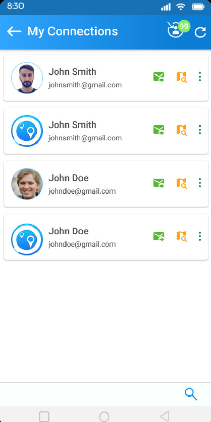
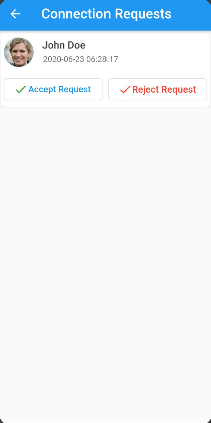
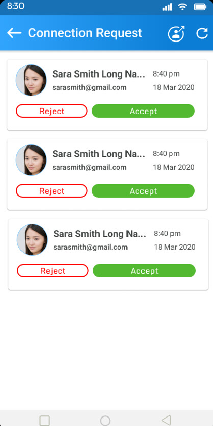
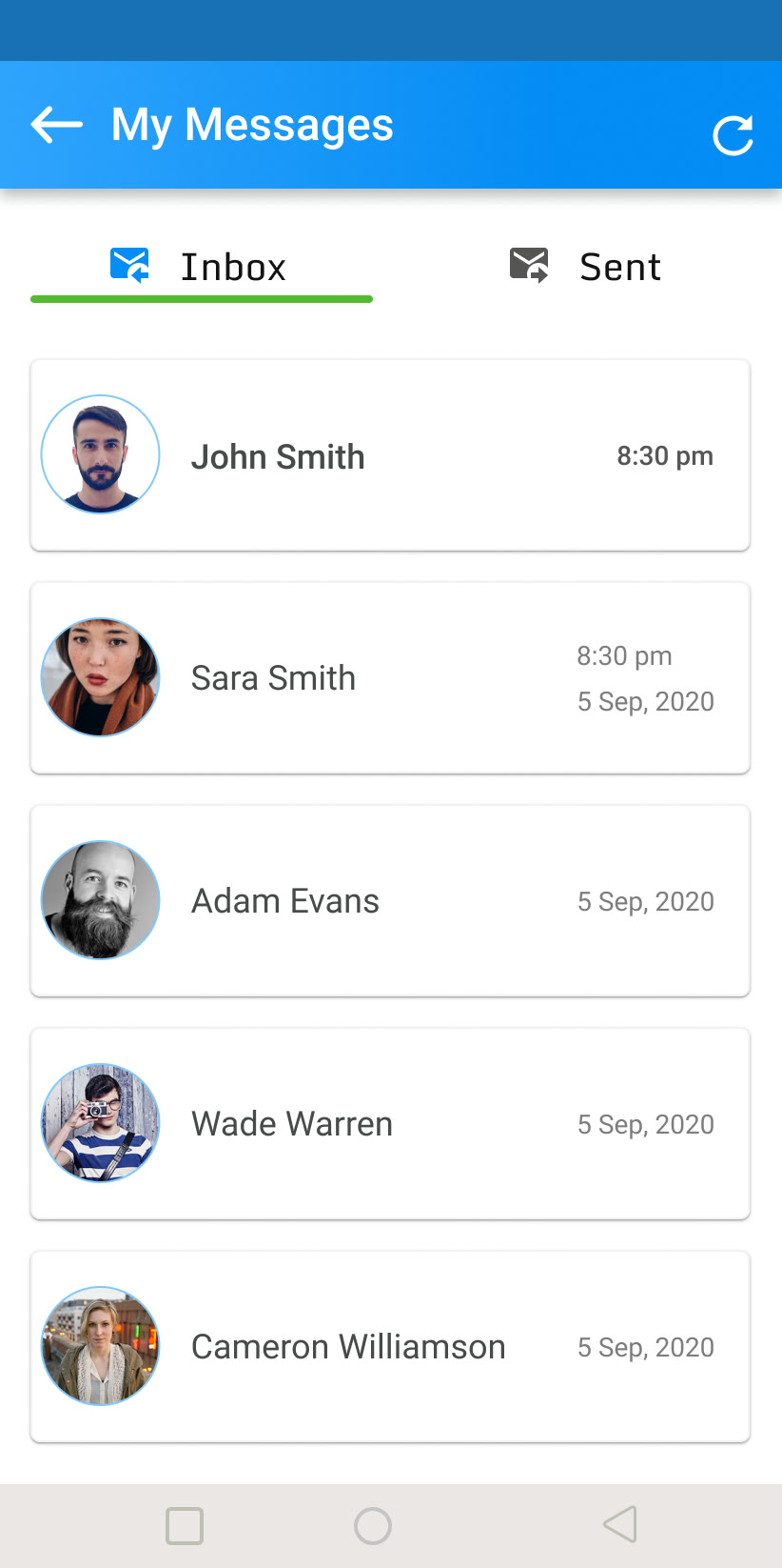
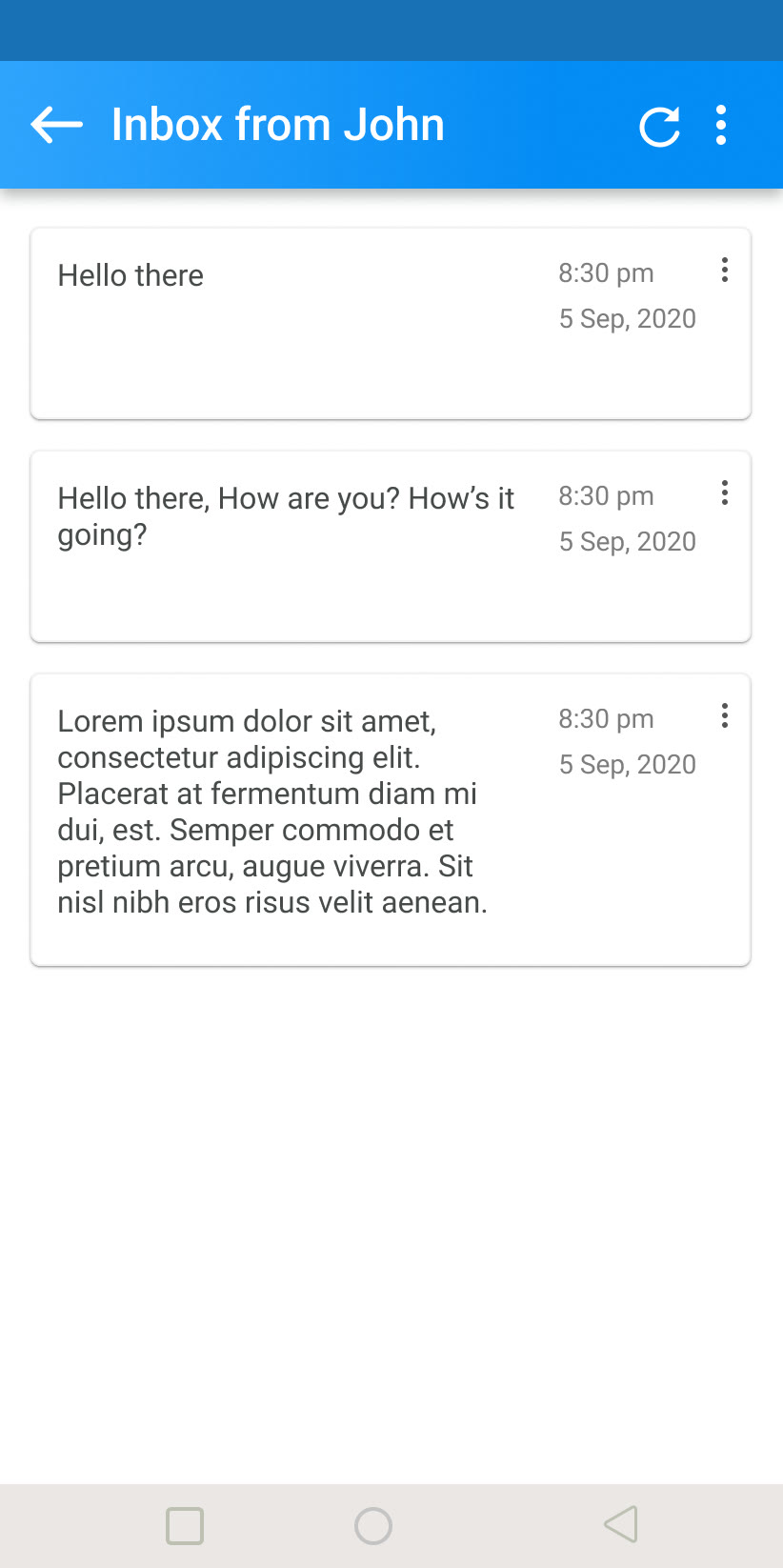
Messaging, from paper sketch to inbox
- Inbox and Sent tabs
- One thread per contact
- Photos in chat
04 / Blocker and recovery
Blocker and recovery
Blocker
An app already built, little room to move
FindMe had already been designed, so there was not much space to work with. The brief: solve its UX issues and keep the client's goal in view.
Recovery
Research first, then fix the weak screens
A competitor analysis of Glympse and Save Location came first. Then the screens with a poor user experience were reworked and new screens added.
Recovered by me
05 / Impact
Streamlined onboarding, more active users
- Active users
- +50%
- After streamlined onboarding and clearer interaction patterns

